


Transform raw data into visual reports in real-time
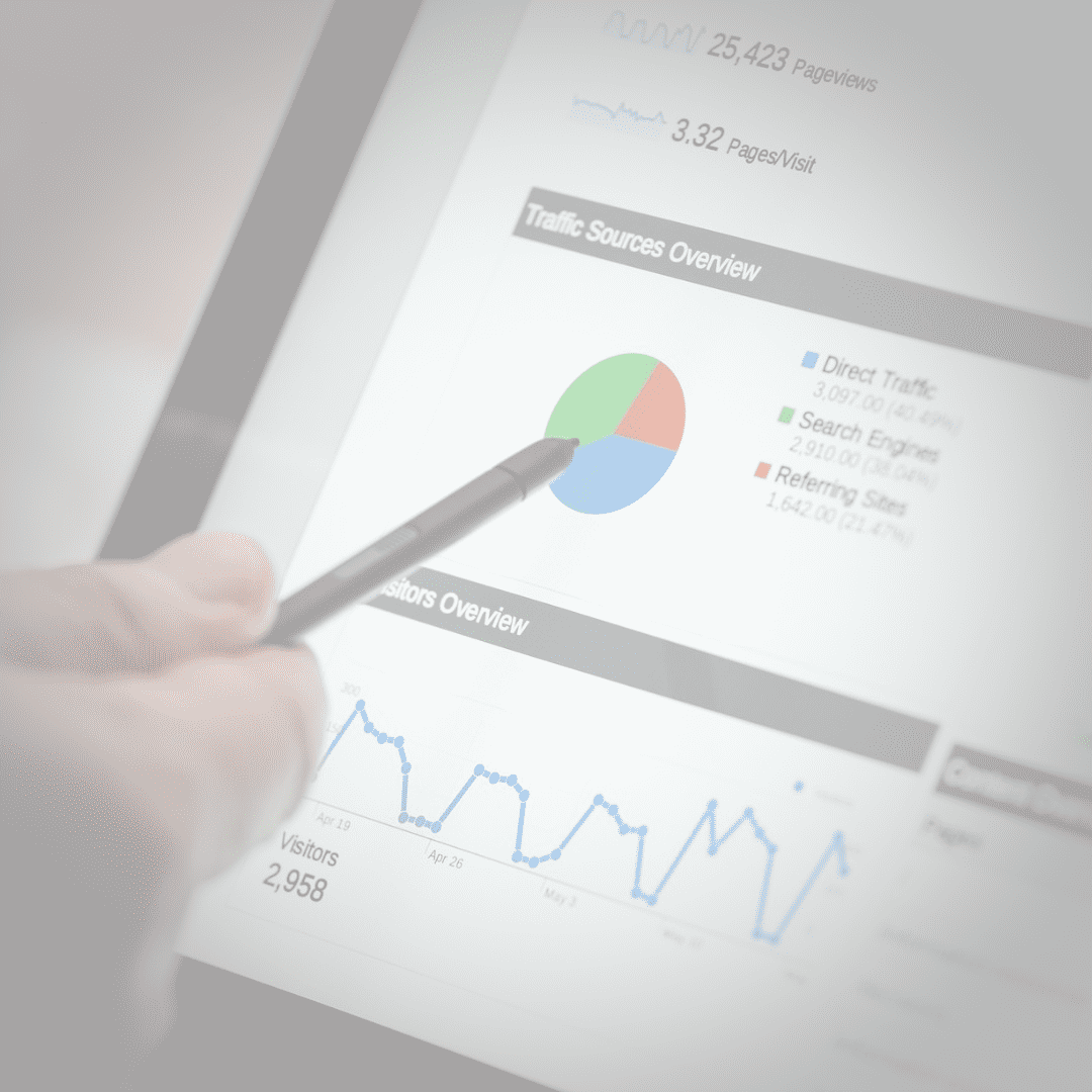
Try Analytics for FreeIn modern business, the speed of decision-making depends on how quickly you can interpret data. QuintaDB's analytics module allows you to create complex graphs and charts based on your online databases in just a few clicks.
Create line, bar, pie, area, or radar charts. Choose the format that best suits your KPIs and business goals.
Your charts change instantly as new records are added. No manual recalculations — only up-to-date information.
Add filtering widgets to dashboards to analyze specific time periods, categories, or individual performance indicators.
Combine multiple reports on a single page. Create custom monitoring panels (Dashboards) for different departments: sales, marketing, or logistics. You can embed these dashboards into your website, combine them with maps, or provide access via the Customer Portal.
Each created chart has its own embed code. You can integrate analytics into any CMS (WordPress, Joomla, etc.) or use the internal QuintaDB interface.
We have prepared a step-by-step guide to help you quickly master the visualization tools:
Read Article: How to build a chart in QuintaDBCreate your first chart in 5 minutes without a single line of code.
CREATE MY FIRST CHART English
 Italiano
 Español
 Français
 Deutsch
 Português
 Ελληνικά
 Nederlands
 Polski
 Čeština
 中文
中文 日本語
日本語 हिन्दी
 اللغة العربية
 עִברִית
 Türk
Türk Latvietis
 Dansk
Dansk Norsk
Norsk Íslenska
 한국어
한국어 Suomen
 Gaeilge
 Bahasa Melayu
 Svenska